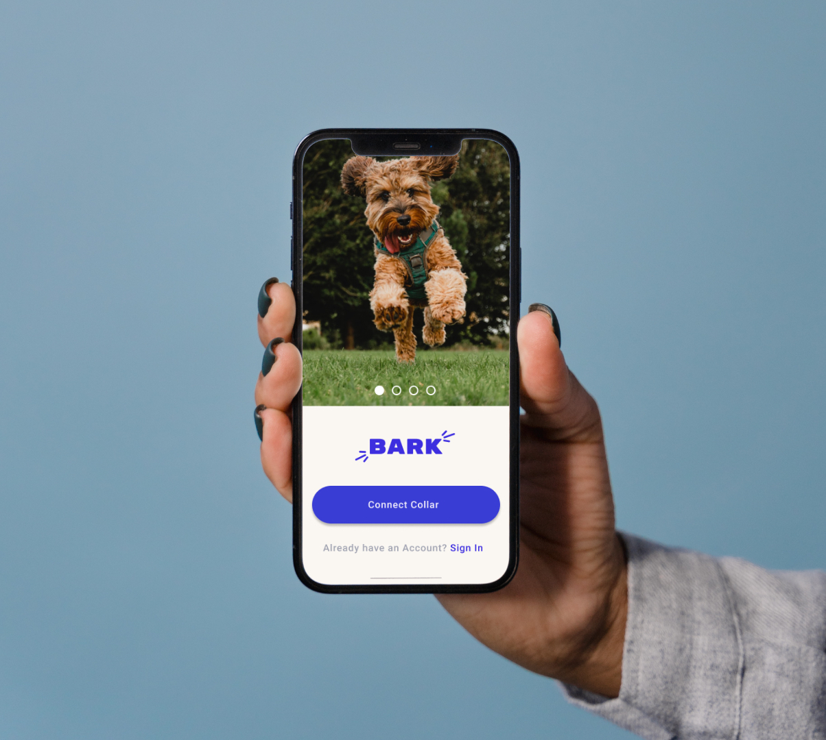

Worked in a team of five designers to create the onboarding for a GPS dog collar that would track the position of the owners' dog within the span of about 11 hours.
Provided insight on the competitive analysis, which composed similar products as well as other GPS tracking apps.
Provided detail for the final prototype UI which included correcting color, placement and scale of various elements.
The Leverege design challenge tasked our team to create the onboarding for a fictitious dog collar which would connect to bluetooth using a mobile application. The app would let the user set up a geographical fence in an urban area tracked by GPS to make sure the dog is safe. Our main goal is to have the owner confident in the location of their dog so an effective onboarding and app tour are crucial.



Communication comes first so we started off by looking at ways to
keep a video stream between all five team members. After some
searching, I created a discord group and managed to keep an
uninterrupted video stream that lasted us the entire day. We
unanimously decided on using Miro for our whiteboarding and Figma
for the prototype to keep collaboration simultaneous. Keeping track
of a time schedule and notes were taken care of by a shared google
doc.
A.
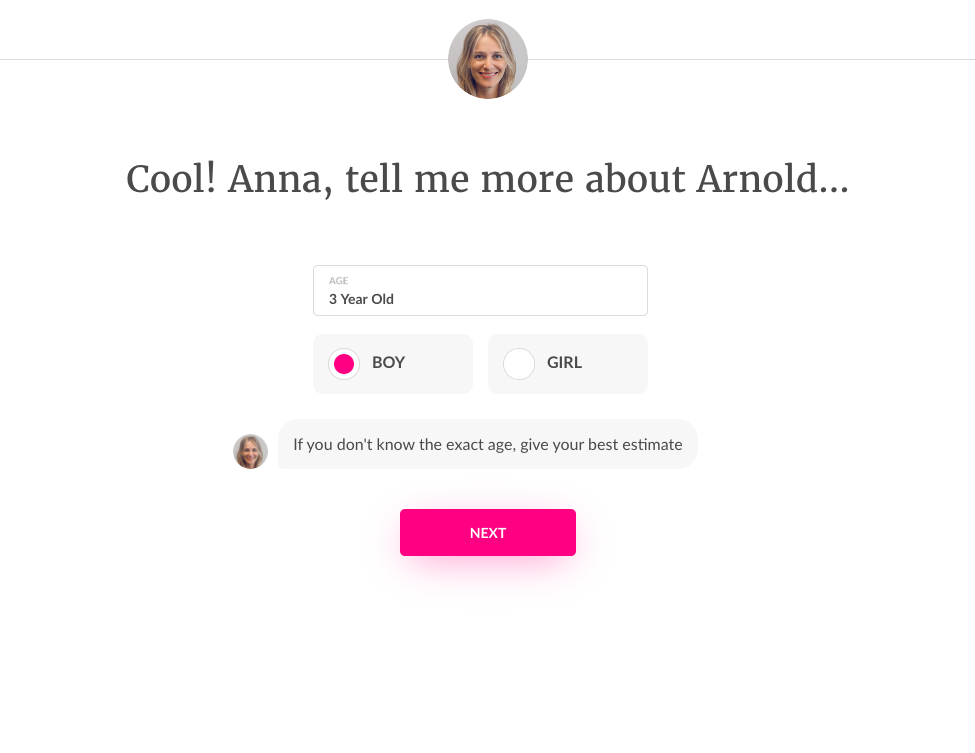
For our competitive
analysis, we realized that profile creation was usually included in
the onboarding. I made sure to include a well known online pet
insurance provider
Lemonade
that had a successful estimate questionnaire. This along with
competitor apps served as our starting point.
B.
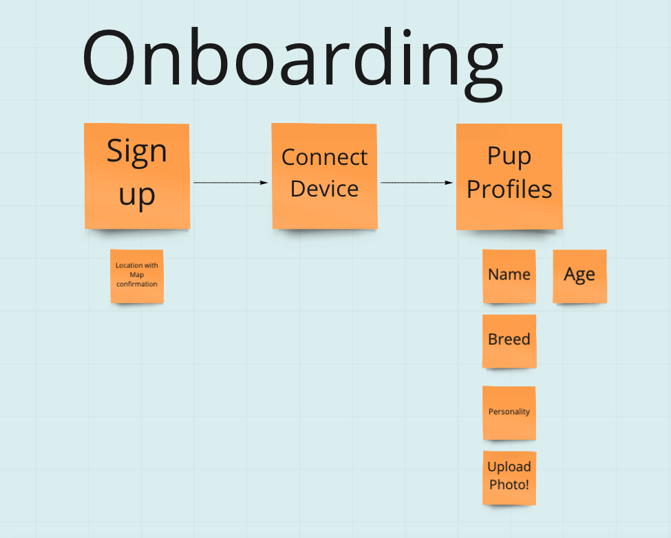
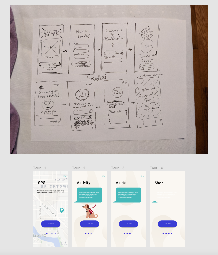
While whiteboarding on
Miro, we came up with the foundational user flow for the onboarding.
We would later add the tour to familiarize the user with the app.
Additions such as a "Lost Dog" feature were included, but
never realized to focus on the challenge goal.
C.
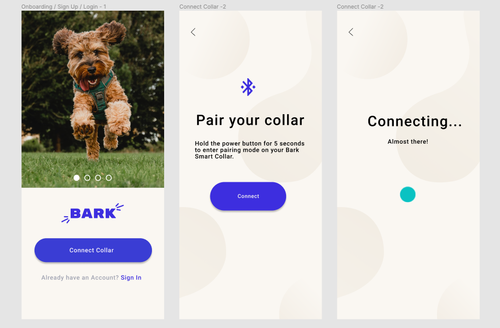
I focused on the UI for the
duration of wireframing and prototyping while two other teammates
designed screens to later be tested. I agreed that the color scheme
should remain consistent with Leverege's UI, as I tried to treat
the company as a real client. I supplied common components such as
buttons and headers from a meditation app UI kit.
D.
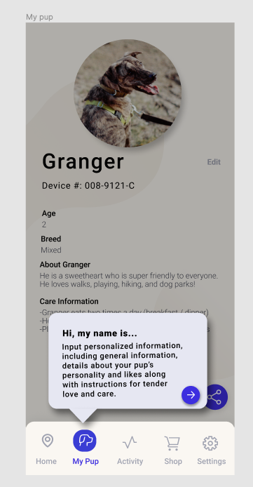
I would use Figma's
present mode to make sure the UI maintained consistency after changes
and new screens were added. The team and I would take up about two
hours designing screens for the onboarding, profile and app tour.
Teamwork really shined here as we designed a consistent product using
our skills efficiently.
E.
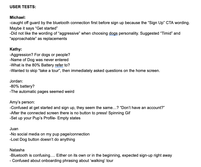
After I focused on the UI,
the team agreed that it was time to find a participant close by to do
some user testing. Feedback let me target three main pain points of
our app at that stage, mainly that the initial bluetooth connection
was before the sign up, wording was confusing, and the battery life
needed to be clarified. After some refining and a second test,
presentation work began.
Our working prototype can be seen here.
While personal projects can be useful skill builders, true growth
comes from teamwork. From creating the scheduling and picking
strengths to evaluating feedback, we almost made it look easy.
Constant
communication throughout the entire 11 hours supported us through
the entire design process. Focusing on my strengths allowed the team
and I to create great work in a short time span. While we did not
have the winning design, this hackathon truly serves as an example
of what a true team effort should look like to me. I am immensely
proud of my team and the fantastic work we took on in such a short
time span.