
Created a tested solution that allowed users to search among the collection types and product types from the homepage.
Designed a trim selector that lets users see available trims right from the product page.
Used branding and improved the UI to give the redesign consistency and flow.
The Pelikan company has been making fine writing instruments since 1929 and remain regarded some of the world's finest. Their page however, seriously lacks in terms of branding, usability, organization and upkeep. The product hierarchy and variety that make the company famous is confusing to users and needs to be reevaluated to improve their customers online experience.


After a competitive analysis and user research was done, paper wireframing began to mold my design process. I transitioned to Adobe XD to wireframe and user test before having to stop and user test again for the product page. Once I got my desired results, Adobe XD and Photoshop were used for the final prototype.
I asked friends of mine which were familiar with art supplies and journaling (the closest I could get to a fine writing user) to use the current site to look up pens and explore. All those who were interviewed commented on the overwhelming amount of text. All agreed that being able to look for specific products was challenging which made them feel less likely to use the website again. They agreed that the product images were appealing, but searching of products took too many clicks. One person said that they felt that the white text box against the dark background felt “jarring” and that the language icon (a white globe) on the navbar drew too much attention. There was also an overwhelming call for cohesion among the pages.
A.
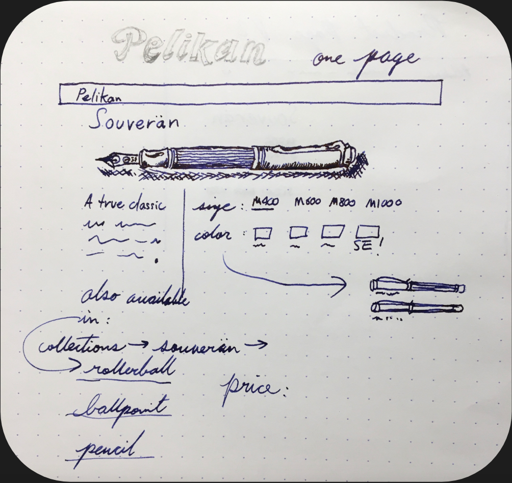
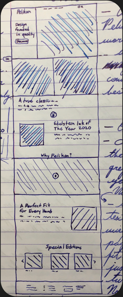
Now for the fun part. After gathering some inspiration from competing fine writing company sites such as Lamy, Montblanc, Caran D’ Ache and even other e-commerce sites such as Moscot Eyewear, I began simple sketches on paper. Sketching took place along side pages and pages of notes. After sifting through ones from early on in production, I found the two main sketches that I used throughout the rest of wireframing. I sectioned out the product page into four main components, image, description, customization, and collection. These components were selected based on testing competitor sites to see which had the most informative product page layout and highest level of impact.
B.
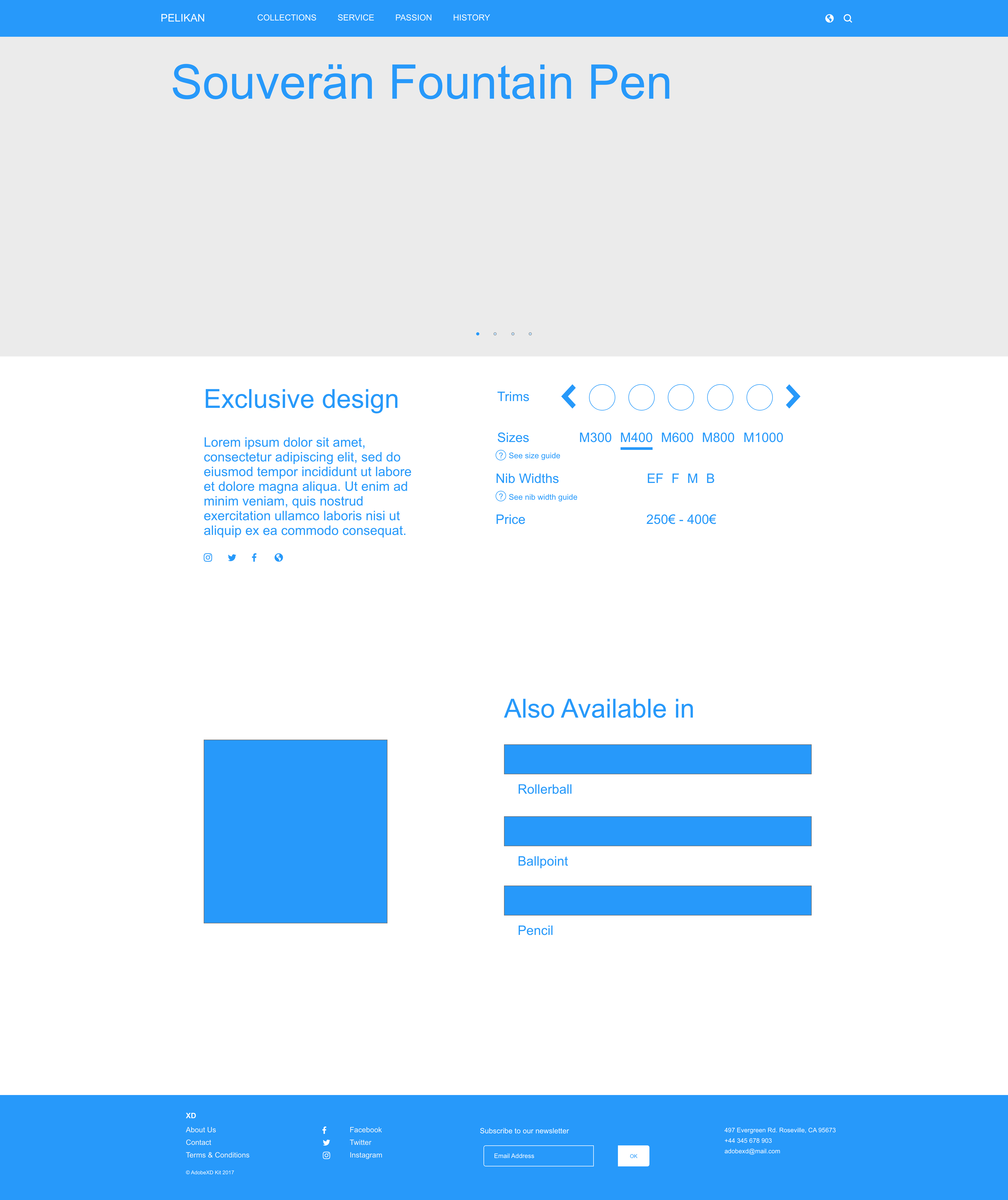
Components shifted around on the product page during wireframing because I wanted to order them based on levels of importance. I left the product page at the stage below because I wanted to confirm with further user testing later. I tried to make sure that I kept the look simple, image-centric and as light on text as possible.
C.
The selections based on the collection on the product page changed constantly over the course of the production. I had a conflict with the trim selection since it was critical for the user to see the current special editions. Also, the size of the model shown along with nib width and price information couldn’t be too far behind.
Looking for a specific trim for a product within a collection shouldn’t require exiting the product page. Instead, a streamlined product display page that contains a selector for trims and special editions available will be within the collection. Sizes available for the collection and/or trim are displayed on the side along with the pricing and nib width information. With this solution, there is only one page per collection, containing all trims and writing instrument variations.

D.
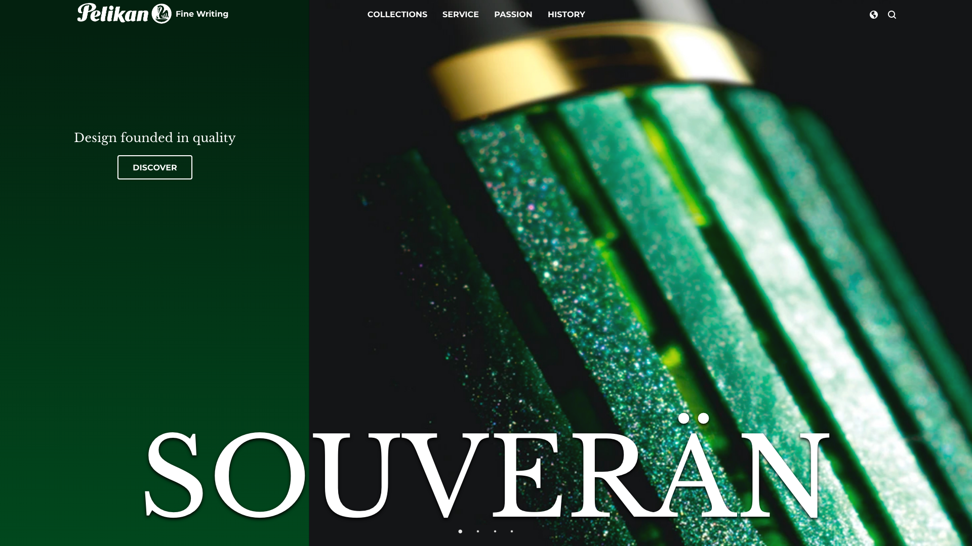
Using a navbar that allows the user to see the extent of the writing collection plus the ink collections and accessories eliminates the need to separate collections from individual product types. As the user hovers over a writing collection in the navbar, they can see what each individual collection consists of (Fountain pen, Rollerball, Ballpoint, Pencil). With the new navbar, the user can access a collection or specific instrument within a collection all from the homepage.
E.
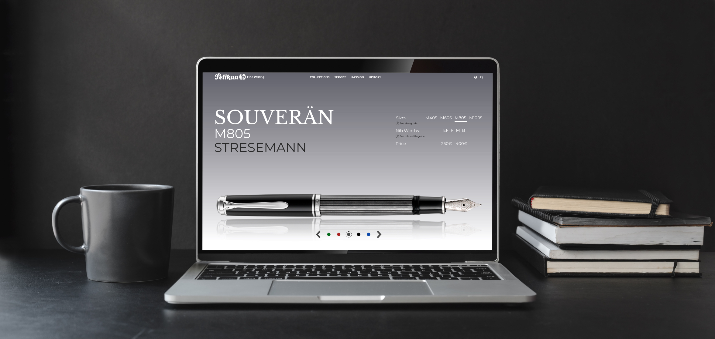
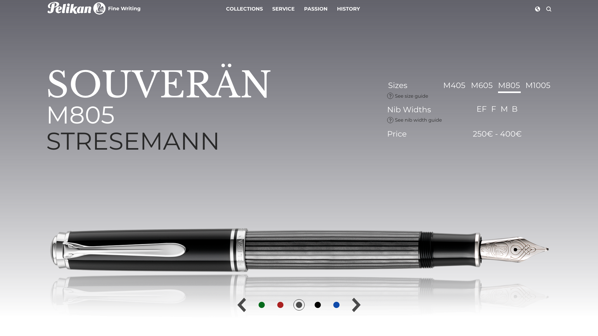
This is the final product page for the Souverän collection. This page took the most amount of time and attempts to get just right. Early versions had a dark background and all the product information (Trim, Size, Nib Width, Price) directly under the pen while another version had them all moved off to the right.
None truly captured a sense of simplicity until I moved trim selector to the very bottom of the screen, and made this final version. Having the trim selector separate and obvious lets the user know that this is the most important variable. The look of the pen is the main selling point anyway, so having it be easy to change is critical for the page’s success.
There was a lot to take away from this project. What I originally thought would be a quick redesign turned into an in depth analysis on usability. I gained a much greater understanding of user needs with the help of the interviews. Talking to users and watching them use the old site made me highlight key issues I needed to address plus some I hadn’t even though of yet. After doing final user testing, I concluded that I had reached my goals by having users easily access products by increasing usability and delivering a better designed product.