CONCEPT
Diish
Recipe
Feature
CONTEXT
As a way to practice better UI and color usage, I had the idea of making a cooking app interface that made use of a guided recipe feature. This guide mode would play a recipe video as you cook and allow you to use voice commands to pause, play, or go back a few seconds in case the user's hands are occupied. I felt this idea was simple enough to be easily implemented into cooking apps with the use of some well thought out UI, so I began wireframing.
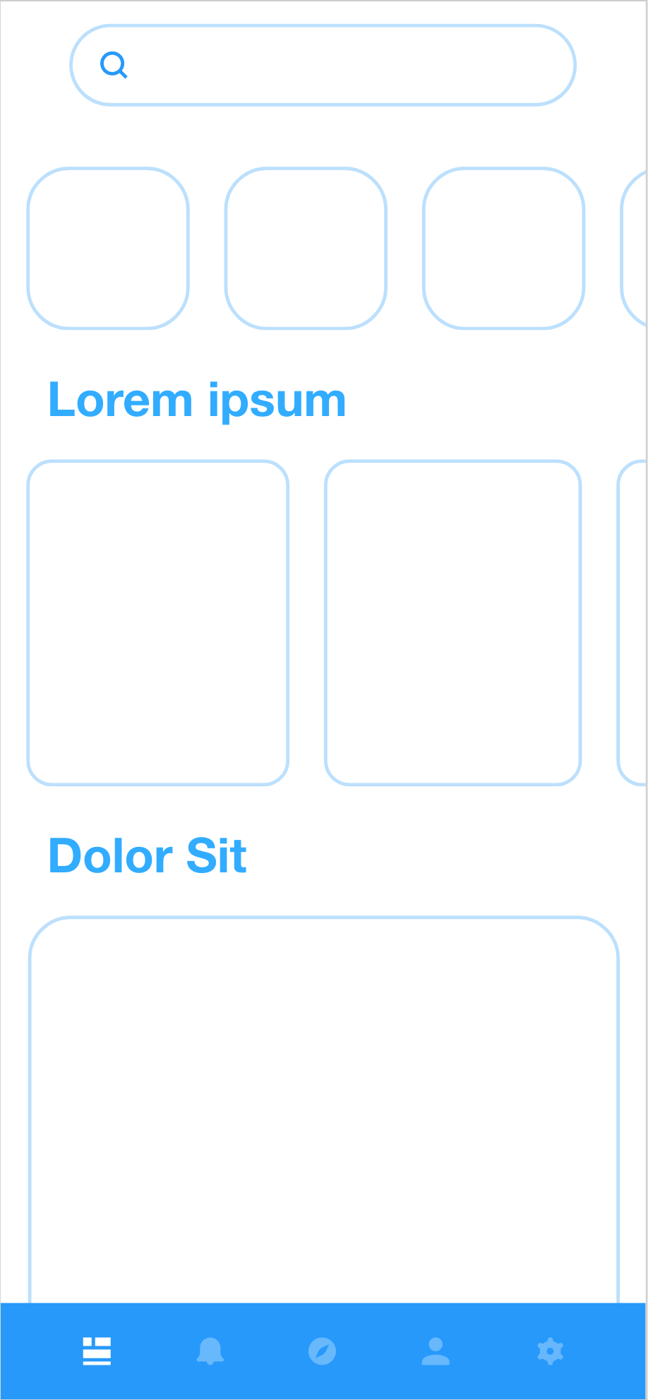
A.
I felt that the simplest approach would be the most effective for the homepage. I wanted category buttons to line the top while trending recipes could be grouped below. I also followed a basic tile size hierarchy to ease a visual flow to my design.
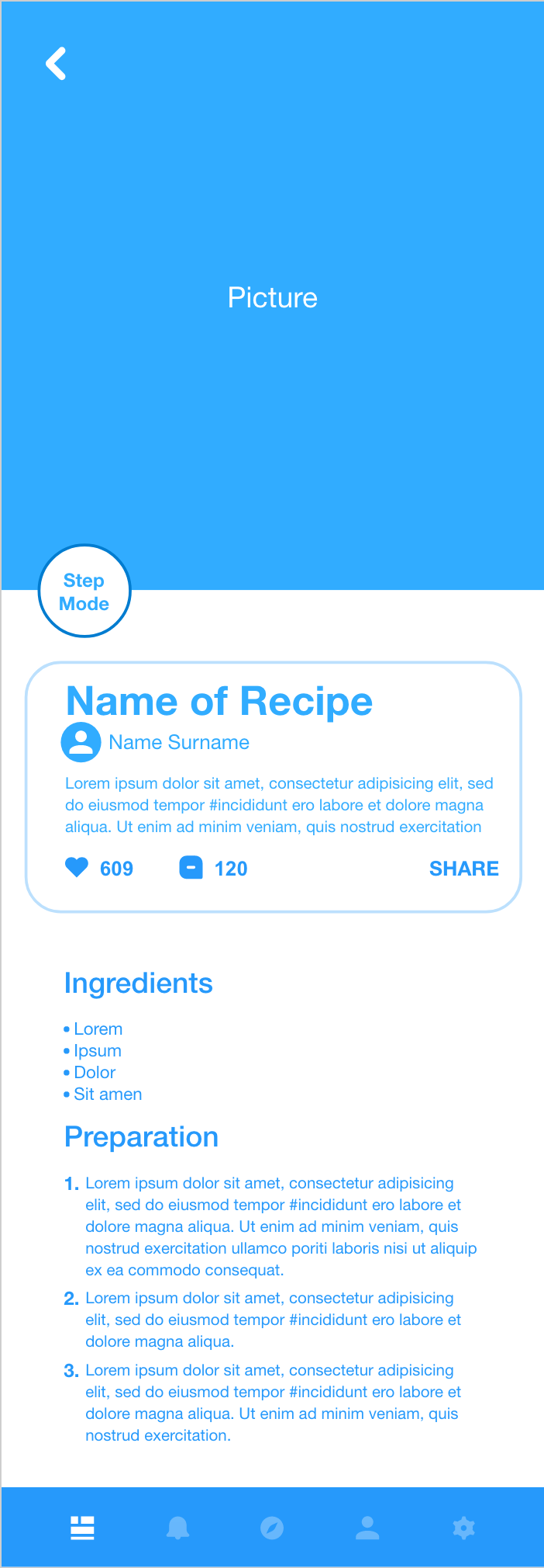

B.
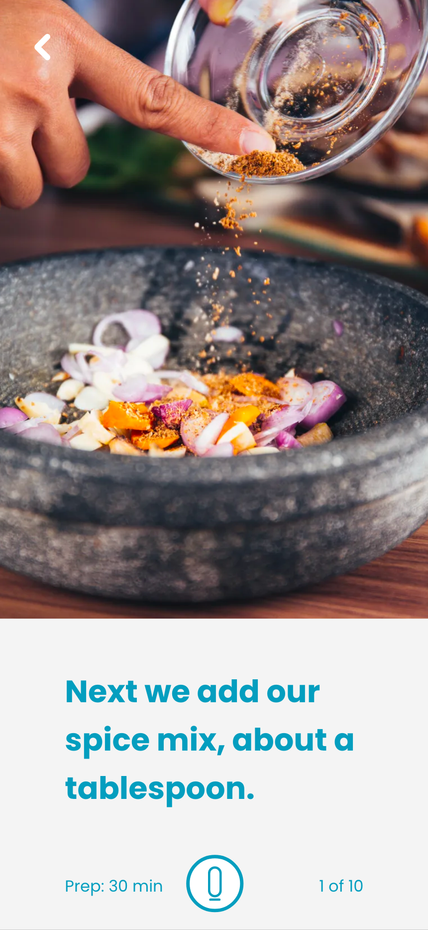
For the guided feature, the video would take up two thirds of the screen while a subtitle space would take up the last third. The microphone button would turn on the listening feature so it is placed where it can easily be found along with the number of steps and the estimated prep time.
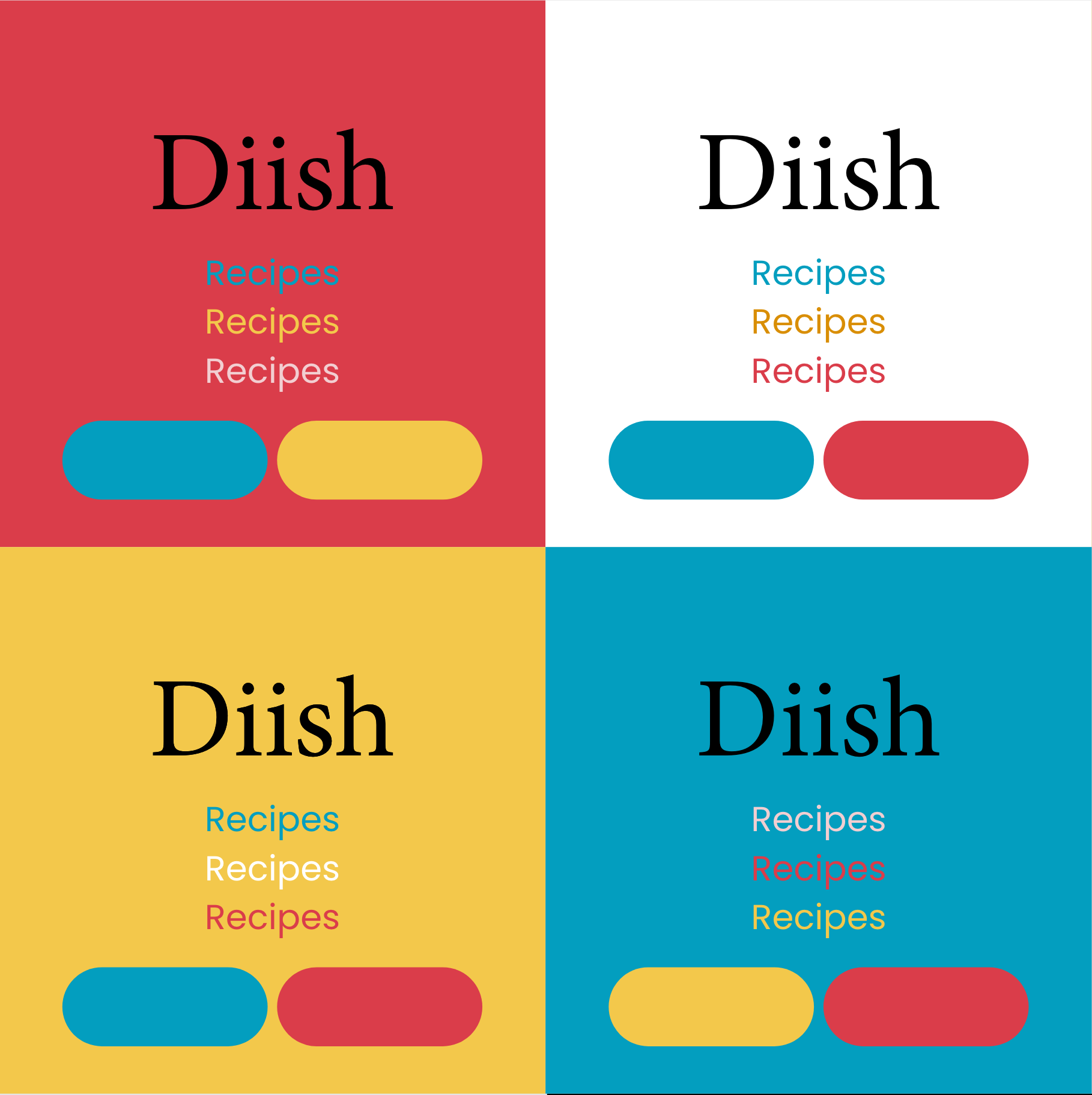
C.
This is my new way of picking color usage. I picked a color palette off of Adobe Color and made a color grid. Here I can use variations to determine which colors are most readable for potential headings and buttons.
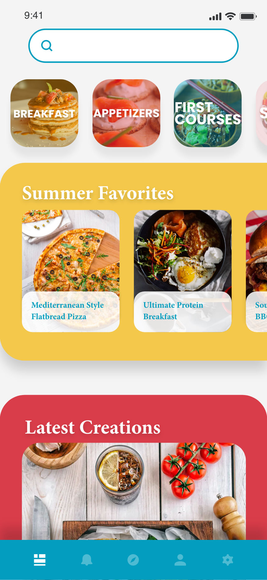
D.
The center links were resized to have a link hang off the side and make way for an intuitive use of color that was made to look as if it continued off the page. This way the user knows to scroll horizontally to see more of the Summer Favorites section.

E.
The color grid came in handy for the recipe page. Here I could tell that the blue would be the best choice as a heading color. The cherry red really shines here, making sure you don't visually miss the guide mode button or the recipe like button. On the guide mode page, the simple page ratio with a clear font and color combine perfectly to make a highly effective user experience.