WORK
-
Researched booking and travel apps such as Delta, Southwest and Amtrak for competitive analysis
-
Gauged user feedback on competitive company apps to create the proposed wireframe.
-
User tested wireframe to improve user pain points and create the final prototype.
WHY
Opened in January of 2018, Brightline hopes to provide fast transport to the traffic dense area of South Florida. With three current stations and a planned expansion to Orlando, Brightline could start a high speed rail boom in the United States. At the moment, their mobile app has been taken down from app stores most likely due to the current COVID-19 pandemic. Despite not having much reference for their prior work, I decided to try my take on a ticket booking feature for their mobile platform that would increase optimization.
HOW
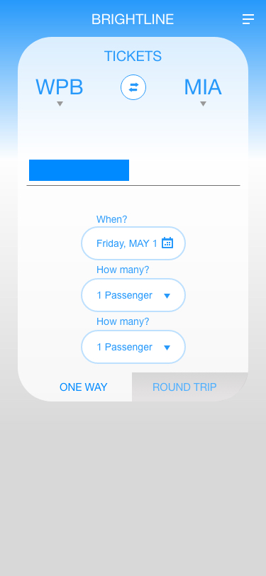
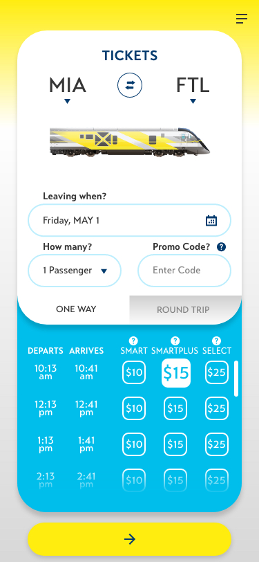
I wanted to give the ticket selection process a much more visual and
intuitive take while reducing the number of screens. After looking
at other booking apps such as Amtrak and multiple airlines, I
realized that the origin and destination selection should be what
the user should see first. All other form details should follow,
along with a noticeable way to select between a one way ticket and a
round trip ticket. With this in mind, I could now start to wireframe
in XD.
ROLE
A.
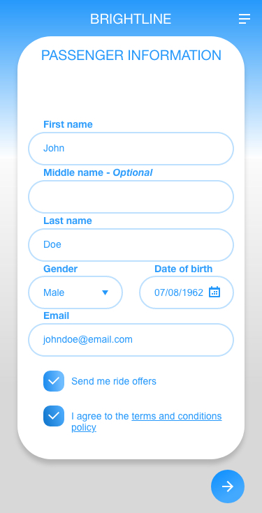
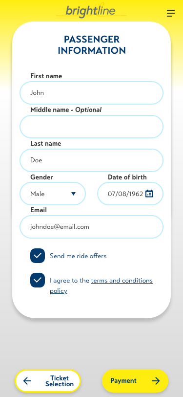
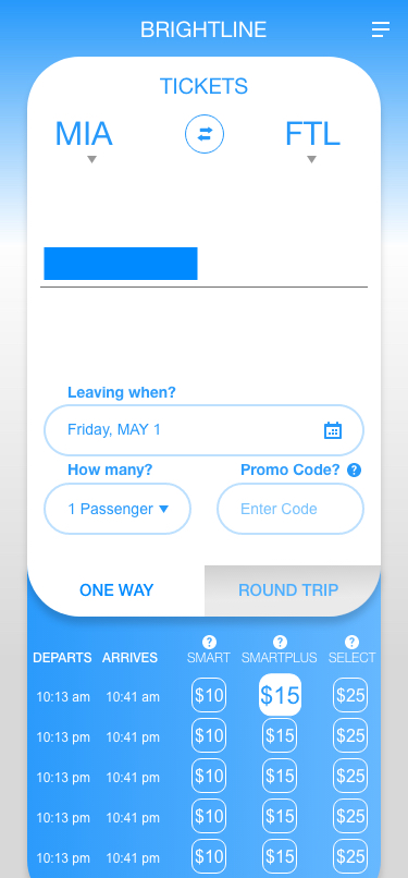
Here I show the evolution
throughout the course of production. While here I condensed the
process to three screens, there were actually fifteen iterations to
reach the final prototype on the right. In this first wireframe, I
ran into readability problems with the times section during user
testing. Also, the proceed button at the bottom wound be moved
because I didn't think it was noticeable enough to users.